Kappa Create Co., Ltd.Kappa Sushi – Modern Pop Sushi Campaign
Hakuhodo Inc.


Kappa Sushi was the No. 1 sushi-go-round restaurant in Japan until 2010. Its share then dropped to fourth as competitors started vigorously introducing new products and Kappa Sushi began losing customers. Kappa Sushi came to be seen as a restaurant where the quality matched the price. It began to feel outdated compared to its new competitors, whereas in fact, the quality of the sushi had actually improved a lot.
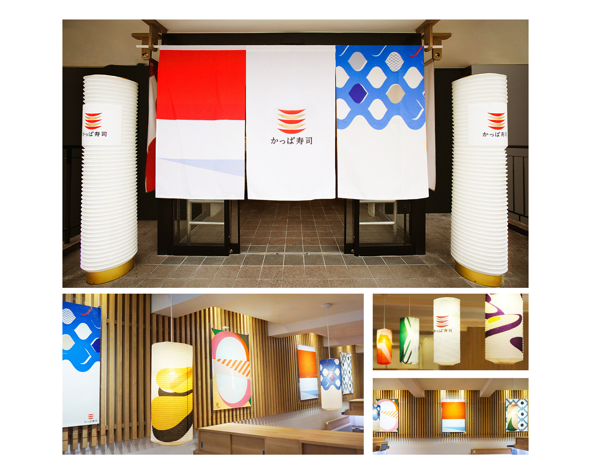
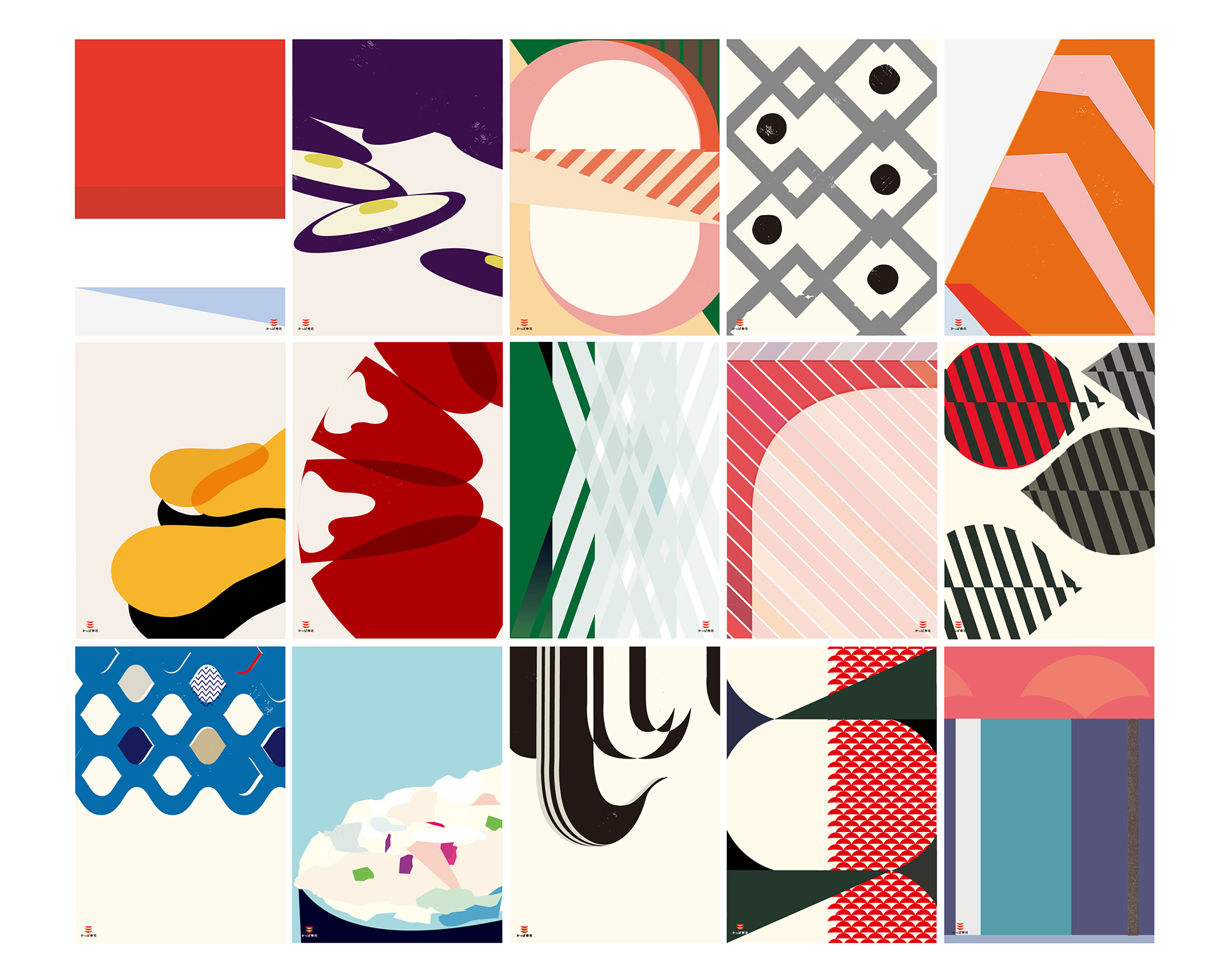
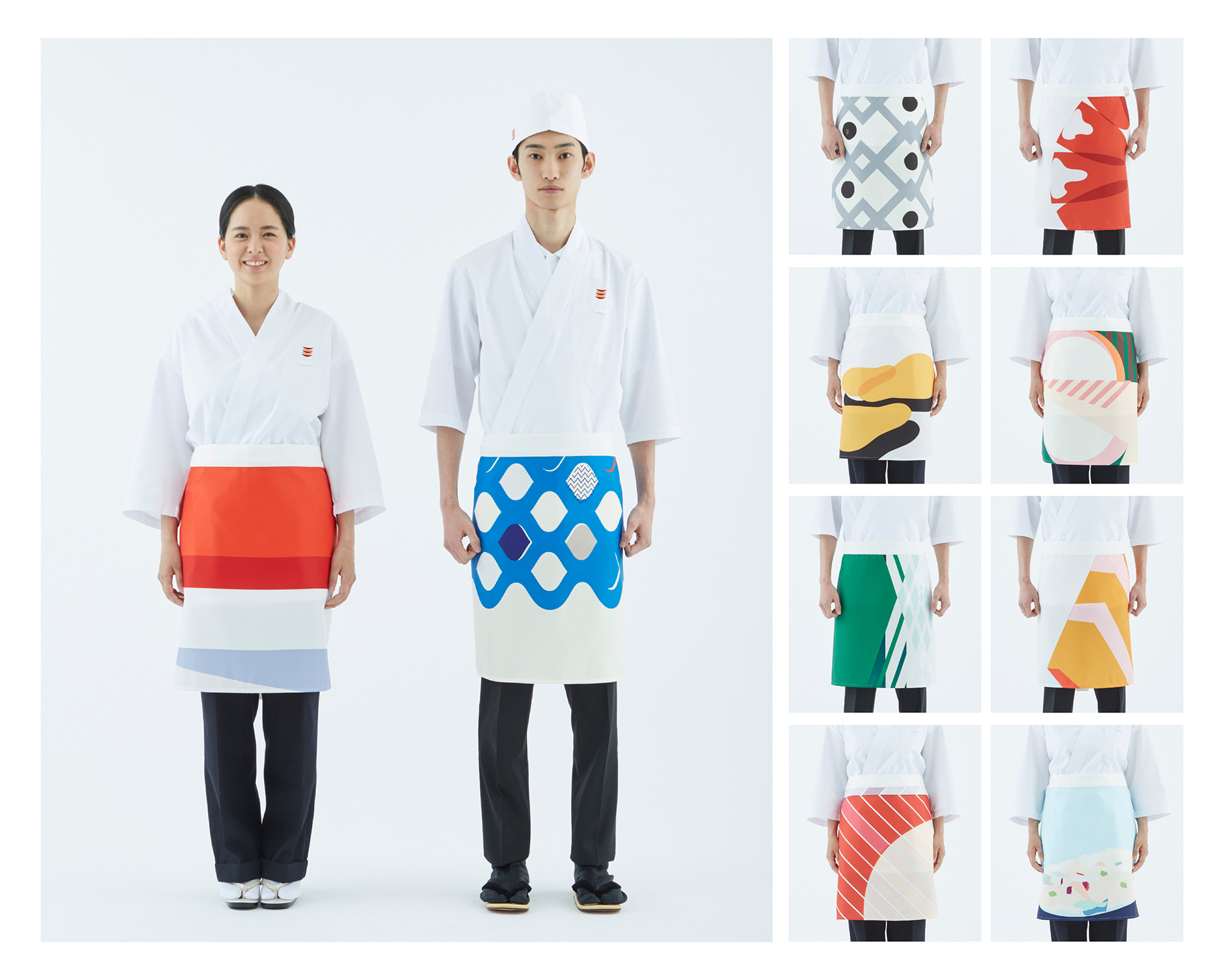
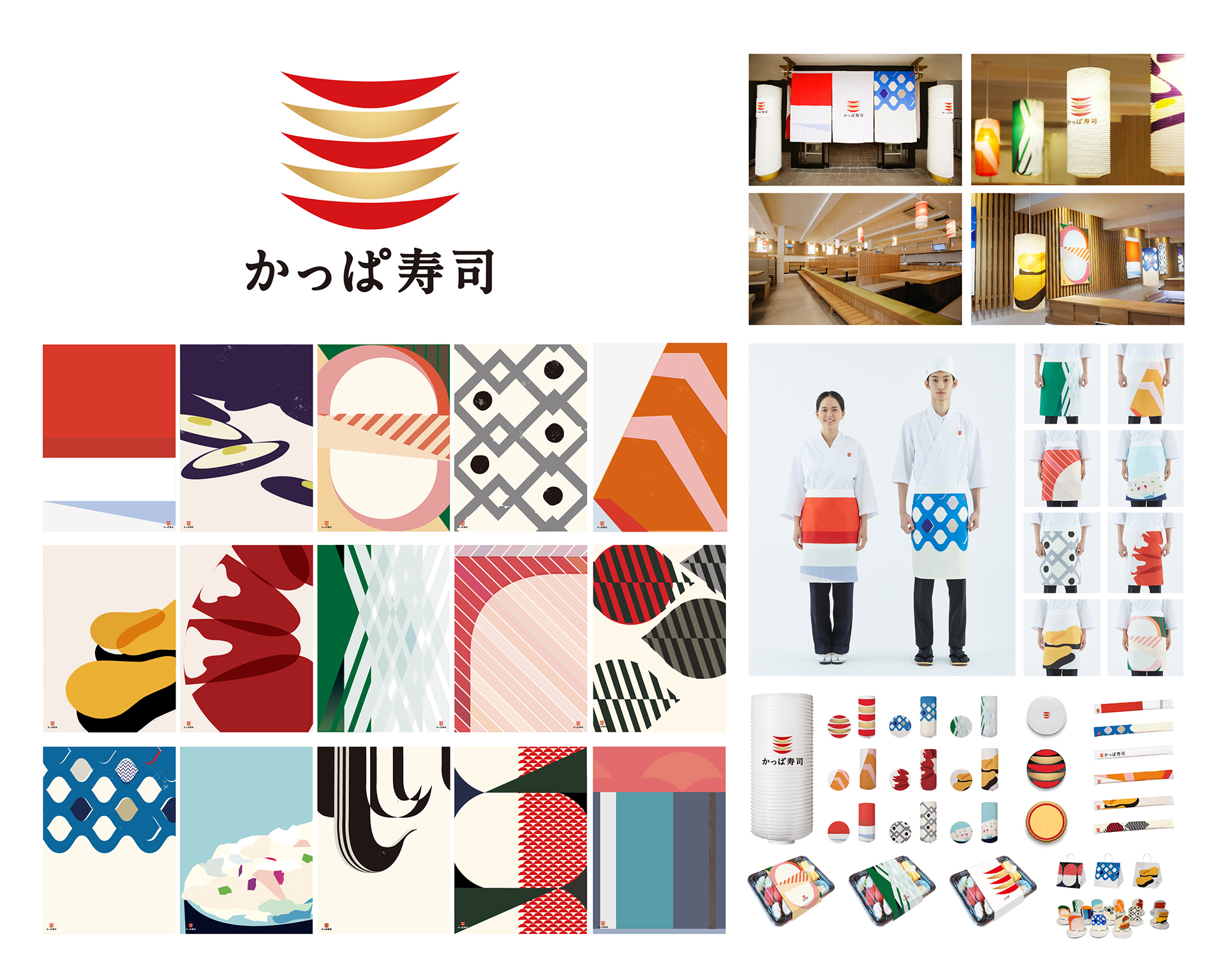
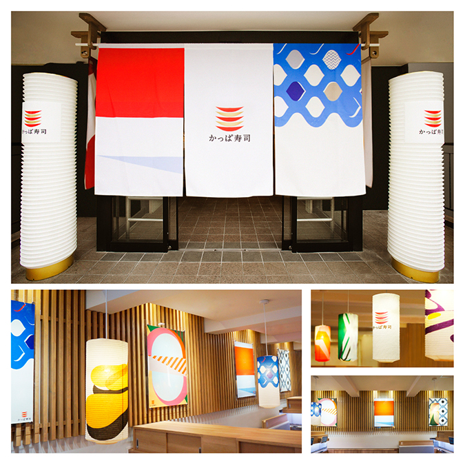
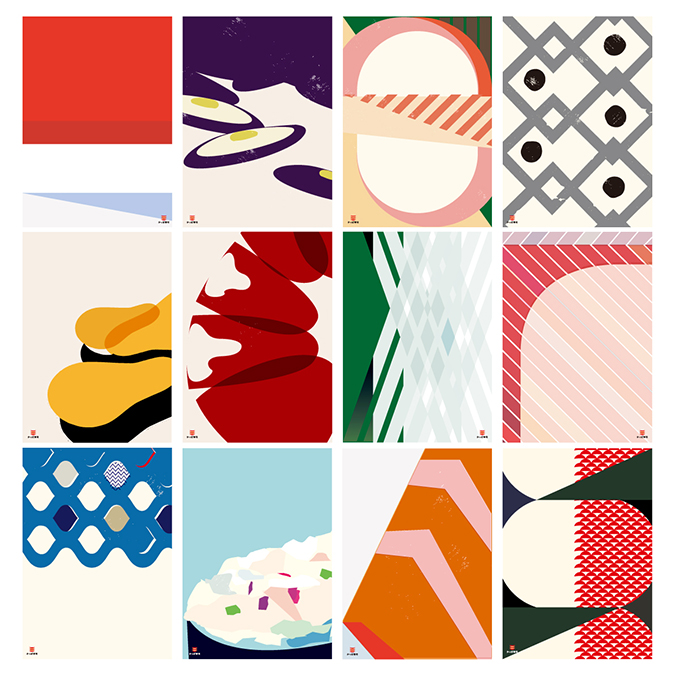
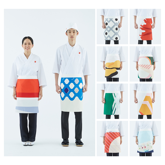
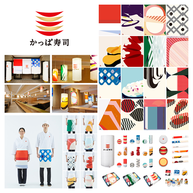
In order to re-brand Kappa Sushi and eliminate this image, we focused on brightening up outlets with modern, iconic illustrations of sushi on posters and lampshades and staff aprons. Various vivid, eye-catching colors gave life to the generally unappetizing colors of raw fish and cheered up the atmosphere in the restaurants. Guests were entertained with bold yet delicate designs that made you wonder what fish was being featured. Both color and design were created with distinctive Japanese tastes in mind.
Awards
-
2018 ADFEST: Bronze (Design Lotus)
-
2017 London International Awards: Bronze (Design)
-
2017 The One Show: Merit (Design)
-
2017 The ADC Annual Awards: Bronze (Design), Merit (Design x 2)
-
2017 D&AD: Wood Pencil (Art Direction), Graphite Pencil (Branding)